The U.S. economy is all about consumer spending, which is why the consumer is closely monitored by Fed policymakers and market participants. During the go-go years of the stock market, pundits right and left commented on the "wealth effect," in which each dollar in increased wealth generated three to five cents of additional consumer spending. Indeed, rapidly rising stock prices did increase the paper wealth of many consumers, who in turn went out and borrowed additional money to buy even more goods and services. But as the stock market has declined over the past year, many analysts have feared that the wealth effect would go into reverse and consumer spending would collapse.
The fact of the matter is that the greatest portion of consumer income comes from wages and salaries. That means that having a job is the single key factor behind consumer spending. It is such a simple point, but in this day and age where minuscule stock price movements get analyzed and re-analyzed on business talk shows, it gets lost in the shuffle.
Economists and policymakers follow four labor market indicators, which vary in degrees of importance. New jobless claims are available weekly, a frequency that elevates their status. Unfortunately, higher frequency data tends to exhibit a greater degree of noise. Weekly jobless claims are certainly useful in helping to provide a snapshot of labor market conditions, but the figures are easily distorted and should be interpreted with caution. A four-week moving average of the series tends to give truer indications of the trend. We compare new jobless claims with three other key indicators that are available monthly.
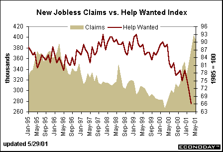
The Conference Board's help wanted index is a good indicator of labor market tightness. This index was holding at rather high levels through the end of 1999, although even then the index began to head south. The year 2000 saw a sharp downward trend in help wanted advertising and by March 2001 this index had fallen to its lowest level in nearly a decade. The downward trend in the help wanted index doesn't imply that a recession is on the horizon, but it certainly points to a softer labor market in coming months. The April figures for the help wanted index will be reported on Thursday, May 30.
The chart below shows that new jobless claims track closely with the Challenger job-cut report. Notice that the Challenger job-cut figures were in a relatively stable range between 1995 and 2000 (give or take a few dips and wiggles). In mid-2000, the layoff figures seem to have bottomed out and begun a new upward climb. The latest figures on layoff announcements have reached new highs.
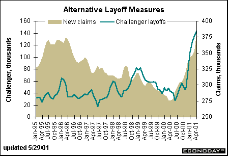
While the Challenger job-cut series is generally a good indicator of labor market tightness, it has been criticized lately because the layoff announcements are not adjusted for time. For instance, even when companies announce layoffs, they don't always intend to cut jobs immediately. Often, they allow jobs to peter out through attrition rather than intentionally handing out pink slips. Yet, the Challenger layoff announcement series has been consistent through time. Therefore, even if levels aren't entirely accurate for short-term patterns, there is no question that the sharp gains in layoff announcements have to mean that the job situation is not as rosy as it was a few years ago. (The Challenger job-cut figures are often available before the employment situation in most months, but the May data will actually be reported on June 4th, one business day after the employment situation.)
Let's face it, everything is about the employment situation. The employment report sets the tone for the month since it is the month's first key indicator. Fed officials have changed monetary policy in the past simply on the figures coming out of this report. (Current Fed officials are loathe to admit that one single indicator has such power, but the fact of the matter is that it is the mother of all market moving indicators.) New jobless claims, the Challenger job-cut report, and even the help wanted index are all used by Wall Street economists to help predict nonfarm payroll employment.
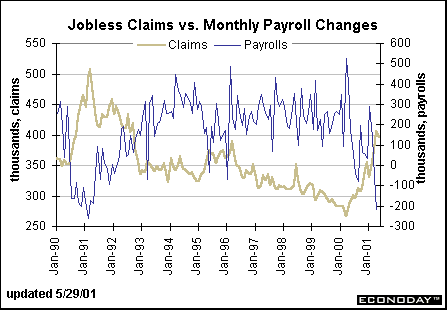
The best single predictor in the secondary group is probably weekly claims. Looking at this series over a horizon of 20 years or so, one can compare levels of jobless claims with levels of changes in nonfarm payroll. For instance, the chart below shows that jobless claims were running around 450,000 to 500,000 per week when nonfarm payrolls were actually declining in 1990-91.
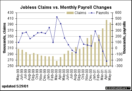
The chart below shows that the first drop in payrolls in March (-53,000) corresponded with a jobless claims figure that was in excess of 370,000 (near the 400,000 mark normally associated with declines). In April, new claims rose further to 405,000 and nonfarm payrolls declined 223,000 for the month. Thus, the historical pattern persists. Only three of the four weeks of May are currently available for jobless claims, and these have averaged 396,000 for the month. This is certainly close to 400,000 and could point to another drop in nonfarm payroll employment for the month of May (released on Friday, June 1). The market consensus forecast is showing a modest 10,000 drop in payrolls.
Do pay attention to the jobless claims figures as well as the Conference Board's help wanted index. These two series may give additional clues over where nonfarm payrolls were headed in May.
Evelina M. Tainer, Chief Economist, Econoday
| 